AIGA Houston and The Printing Museum are proud to present an evening with designer, letterer, typographer, and historian Paul Shaw, taking place tomorrow, Thursday, October 27. Don’t miss his talk—sign up here! Get familiar with Shaw’s utterly titanic contributions to our field with this handy list:
Paul Shaw teaches at two institutions: calligraphy and typography at Parsons School of Design and the history of graphic design at the School of Visual Arts.
He wrote a book on Helvetica and the NYC subway system. Michael Bierut called it “one of the best-researched books on modern design to date.”
He chose ten typefaces of the first decade of the millennium. He deemed these “important”: Clearview, Retina, Minuscule, Magma, Warnock Pro, Burgues Script, Studio Lettering, Freight, Yale, and History.
He leads type walks in NYC for the Type Directors Club “dedicated to seeking out beautiful, odd and intriguing examples of lettering in the streetscapes of a single city.” He covers carved inscriptions, painted signs, neon, graffiti, and more.
He has designed or co-designed 18 typefaces.
He is a contributing editor for Print, where he co-writes the Stereotype column with Stephen Coles. He has also contributed to Eye, Baseline, Letter Arts Review, Design Issues, Typography Papers, Printing History, and the Journal of the Printing Historical Society.
He co-curated the groundbreaking exhibition “Blackletter: Type and National Identity” at Cooper Union’s Herb Lubalin Center of Design and Typography. “Crammed with fascinating facts and details, visually punctuated by the repeating, yet constantly changing alphabets,” Roberta Smith of the Times called the show “quite intoxicating.”
He served as the editor of Codex.
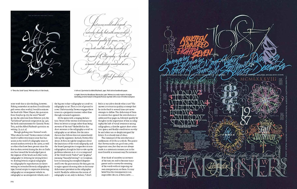
The last issue of Codex evolved into The Eternal Letter, focusing on two periods when the classical Roman capital was popular: the Renaissance and the twentieth century. Erik Spiekermann said “this volume sets the standard for all books that will ever be written on the topic. What an amazing resource! So much research, knowledge, and love have gone into it.”
Speak of the devil: Spiekermann’s Rhyme and Reason: A Typographic Novel, the predecessor to Stop Stealing Sheep, introduced Shaw to the nuances of typography. “His declaration that there were no absolute rules in typography, only a set of interrelated factors (or, as I call them, parameters), made complete sense and simplified typography” for him.
Hermann Zapf was the first type designer Shaw admired. Zapf’s typefaces “seemed to effortlessly integrate calligraphy.”
He said he started drawing letters because he discovered he couldn’t draw trees. “I found the third dimension of branches, even in wintertime, too difficult. Two-dimensional letters were easier to grasp. I must have been about eight years old.”
He organizes the typographic tour Legacy of Letters, which emphasized Rome and Tuscany, and now focuses on the treasures of Northern Italy.
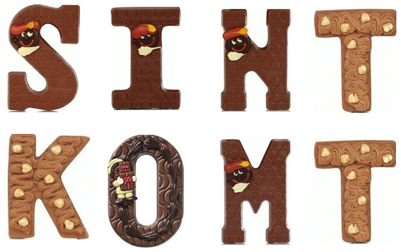
His favorite culinary form of letters: Dutch Christmas chocolate letters.
If you call yourself a type geek, or a font nerd, or a lettercutting dweeb, or a funerary-epigraphy poindexter, and you don’t attend Paul Shaw’s talk, then you can’t call yourself any of those things anymore!