Along with his foundry partner Tobias Frere-Jones, Jonathan Hoefler was awarded the 2013 AIGA Medal for “contributions to the typographic landscape through impeccable craftsmanship, skilled historical reference and insightful vernacular considerations.” Register here for his Sep. 19 lecture at the Museum of Fine Arts, Houston, kicking off the first-ever Houston Design Week.
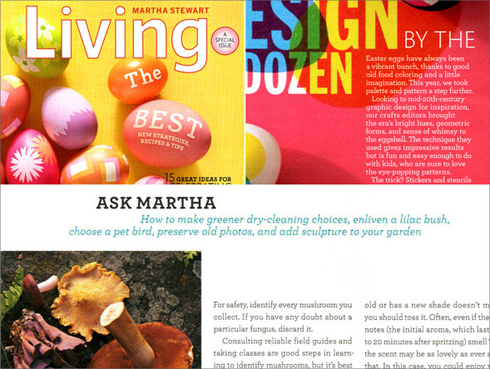
“Sweet but not saccharine, earnest but not grave,” Archer proved that a slab serif could be “pretty, hard-working, and frank.” Commissioned for Martha Stewart Living, H&FJ Archer rapidly became part of the typographic landscape.
As David Earls put it in Typographica, where he named it a favorite typeface of 2008:
with its judicious yet brave use of ball terminals, and blending geometry with sexy cursive forms, all brought together with the kind of historical and intellectual rigour you fully expect from this particular foundry, Archer succeeds where others falter.