Along with his foundry partner Tobias Frere-Jones, Jonathan Hoefler was awarded the 2013 AIGA Medal for “contributions to the typographic landscape through impeccable craftsmanship, skilled historical reference and insightful vernacular considerations.” Register here for his Sep. 19 lecture at the Museum of Fine Arts, Houston, kicking off the first-ever Houston Design Week.
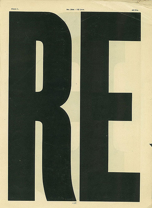
Jonathan Hoefler’s first typeface was Champion Gothic, made up of a half-dozen headline fonts commissioned by Sports Illustrated in 1990. The names of its various widths—Bantamweight through Heavyweight—consciously nodded to boxing weight classes. And its stalwart, guileless forms drew on the red-blooded tradition of American wood type. Pictured below: “No. 266” from Hamilton Manufacturing Company’s Catalogue No. 14 (1899-1900).
Four years later, Sports Illustrated asked H&FJ to expand Champion Gothic. The result was Knockout. Boasting 32 styles, the enhanced typeface offered a flexibility even better suited to the eleventh-hour exigencies of magazine publishing.