Along with his foundry partner Tobias Frere-Jones, Jonathan Hoefler was awarded the 2013 AIGA Medal for “contributions to the typographic landscape through impeccable craftsmanship, skilled historical reference and insightful vernacular considerations. ” Register here for his Sep. 19 lecture at the Museum of Fine Arts, Houston, kicking off the first-ever Houston Design Week.
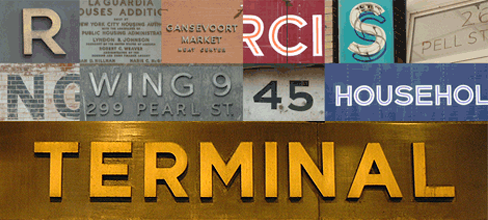
Gotham appeared on the scene as an instant classic. Its roots lay in a prewar tradition of steel, neon, and hand-painted signage—a down-to-earth, uniquely American style you’d find on trucks and above pharmacies. “I’d long had my eye on a particular strain of vernacular lettering that was captured especially well by the sign on the Port Authority Bus Terminal on Eighth Avenue,” Hoefler explained. “Type designers guard their secrets closely, but this one had been hard not to share with Tobias: I knew he’d dig it, and instantly see its potential as the foundation for a family of typefaces. It was one of the first things I pointed out when we began collaborating in 1999, and I don’t think the week was out before Tobias began sketching a prototype for the typeface that would become Gotham Bold.”
Commissioned by GQ in 2000, it shot to prominence as the signature typeface of the Obama 2008 presidential campaign and now adorns the granite cornerstone of the Freedom Tower at the site of the World Trade Center.