Within the Houston design community, we’ve been noticing the work being done and we believe it’s our responsibility to share all the cool work our members are doing across different media that makes H-town look so good. Hopefully, this will be the first of many articles showing off what Houston design is all about.
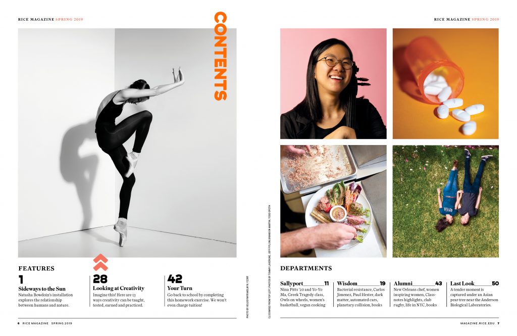
Rice University is an institution of higher learning in Houston and its flagship publication, Rice Magazine, has recently been given a design upgrade from top to bottom. We reached out to Rice Magazine art director, Alese Pickering, to learn a little about the design and the process.
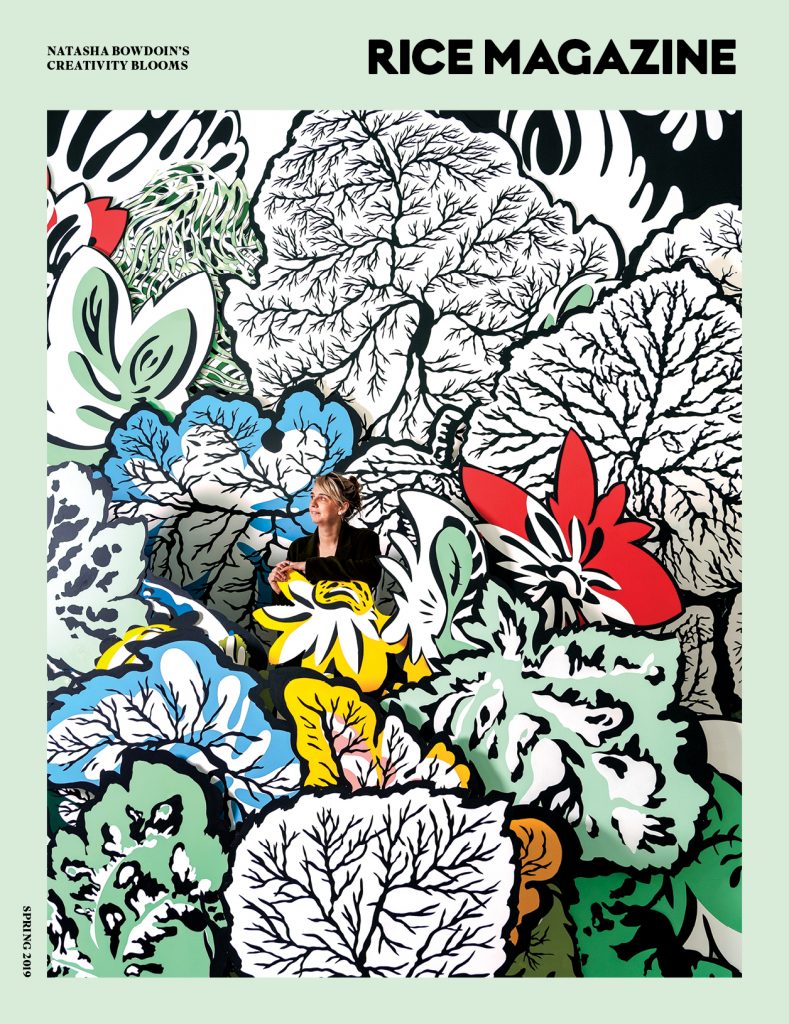
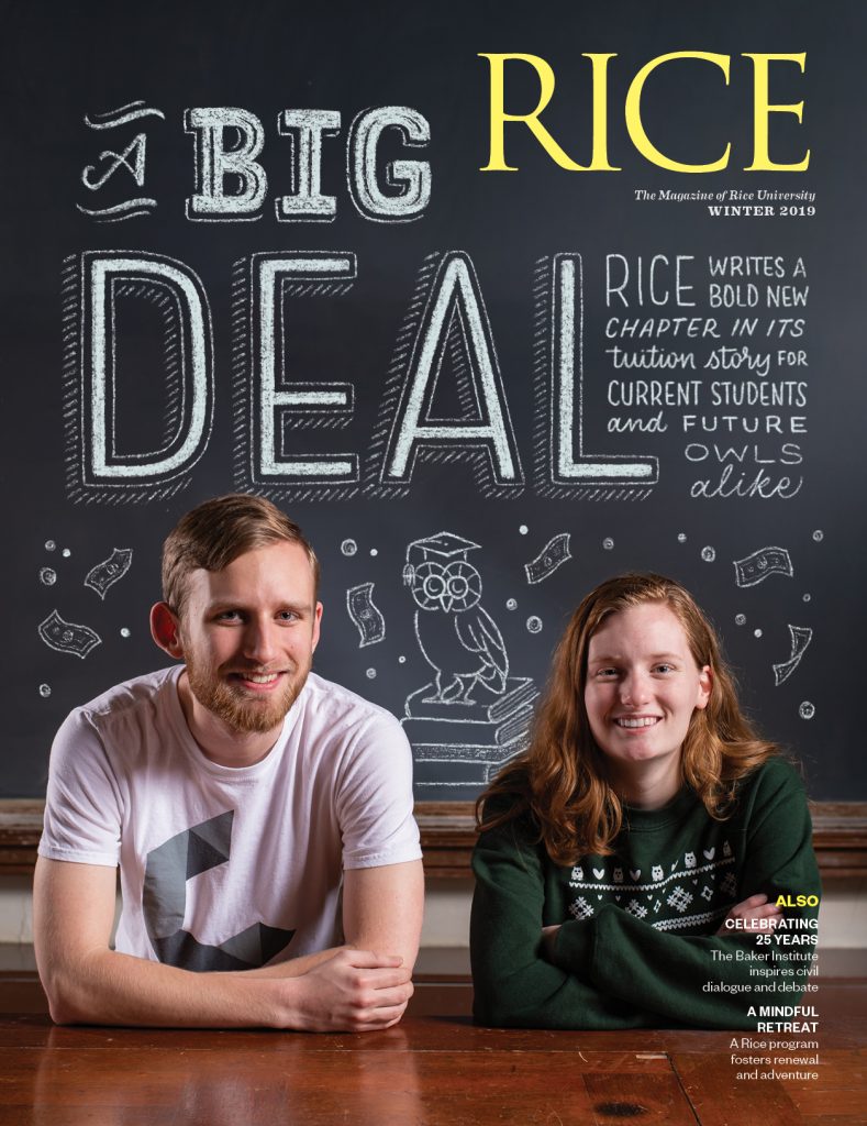
Rice Magazine Cover Redesign
What was the reason behind the redesign of the Rice publication? Why now?
Rice Magazine was last redesigned six years ago and while that design was an improvement on the previous iteration, it was time for an overhaul. The art director who redesigned the magazine in 2013 did it on his own without consulting anyone else on the team. When he presented the new design to the editor, it looked good and was an improvement on the old magazine, so they went with it. But there wasn’t much more thought put into it beyond layout and typography.
Cover design pre-redesign
Interior spread pre-redesign
Over the course of those 6 years, three different art directors worked on that design. So, while we all made small tweaks to improve it, the time had come to make a big change, not only in the look and feel of the magazine, but in the stories we tell and how we tell them.
Can you briefly describe the redesign process?
We wanted to give ourselves enough time to do the research and discovery process it would take to do the publication justice. We print about 57,000 copies of the magazine four times per year. It goes to all living alumni, the parents of current undergraduate students, all Rice staff and faculty, and itis distributed around campus for visitors to pick up. That’s a lot of readers and they all have a meaningful connection to Rice so want to honor that.
We also realize that as a small team, we work in a bubble and were concerned that we might miss something that someone outside might see. We hired Zehno out of New Orleans to consult on the project. We chose Zehno because they were willing to consult and coach rather than actually redesign the magazine for us. I’ve been designing magazines for a long time, so it was important to me to do the design work.
Zehno came to Rice in the summer of 2018 to begin their research. We set up some focus groups for them to meet with without my editor and me present. We felt strongly that people should feel free to give an honest critique of the magazine. We also surveyed a group of our readers for feedback.
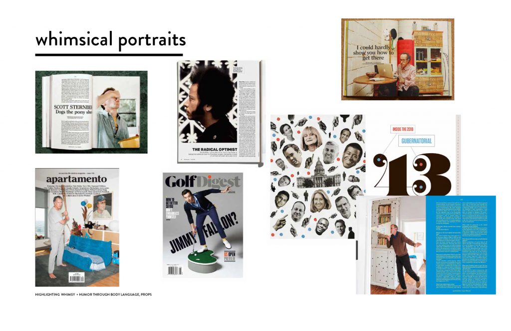
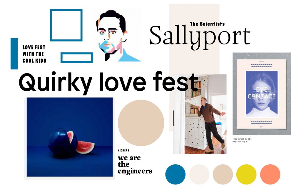
Next came mood boards based on discoveries and discussions we had together about the look, feel and tone of the magazine. We came up with ideas for typography, photography and illustration styles, graphic devices, and ideas for how we would structure the magazine.
One sample of the mood boards that helped to guide the direction of the magazine redesign.
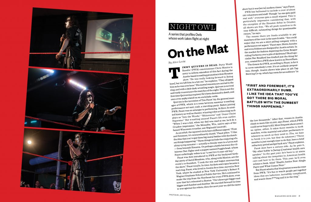
Finally, we got started on prototyping pages. We started with the cover and went from there. Once that was settled, we moved forward with choosing typefaces and prototyping the interior pages. We settled on four typefaces, that’s more fonts than one might normally choose for a publication but I wanted variety and knew that I would use some of them very sparingly to add little bits of the quirk-factor we realized was such an integral part ofRice.
What was your biggest challenge? How did you overcome that challenge?
The biggest challenge was getting buy-in from the folks in leadership — our VP and President Leebron. I was afraid that they wouldn’t go for some of the big changes we were making, including moving one of our feature stories to the front of the magazine before the Table of Contents. We overcame that by doing so much research and making a strong case for why we felt these changes were good for our readers.
Is there a digital component associated with this publication that you helped to develop?
We have an online version of the magazine at magazine.rice.edu which we hope to redesign soon to match the look and feel of the print version. We also have a flip-through version at https://issuu.com/riceuniversity
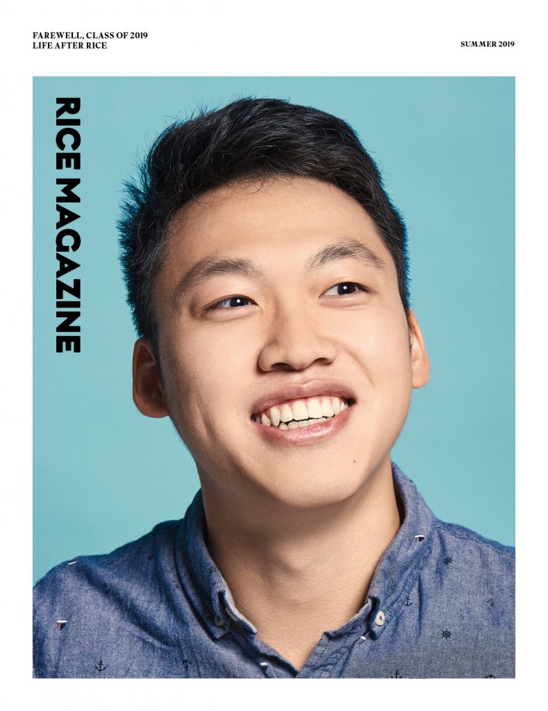
Summer 2019 Cover
What do you love about print publications?
I look at screens all day — too much, actually, according to my weekly screen time report. What a treat it is to tuck into a beautifully designed and printed magazine or newspaper. Plus, you can’t stack digital pieces in your bathroom for your guests to enjoy, can you?
Thanks so much to Alese for sharing her experience with the AIGA Houston community. You can learn more about her online: